Exploring the intersection of reflection and light, attraction and repulsion, and the soft and raw power of feminine forms.
Pink is a loaded color for Stephanie Metz, a San Jose–based sculptor whose artwork often grows out of her desire to explore meaning in the everyday things around her. She remembers going to toy stores as a little girl and resenting all the pink, girly toys she saw. She explains, “Pink always seemed like it was derogatory or diminutive—like a way to make something overly cute and helpless. I felt like that was so often paired with ideas of femininity, and I just didn’t like that as a little kid.”
Over the years, though, Stephanie’s relationships with many things—including art, sculpting, femininity, and the color pink—has changed. “I remember I was taking a walk with my dog, and we came across a bougainvillea bush that was so intense,” she says. “I stood up really close to it, and I was so overwhelmed by it. But it also occurred to me that what I was actually experiencing was the light reflecting off of those bright pink flowers.”
This experience inspired Stephanie to experiment with placing bright pink pigment against stark white walls to see if she could elicit any reflections. She then developed a series of hand-stitched felt panel sculptures that play with the concept of bounced light. For each piece, viewers think they’re seeing a bit of pink-tinted felt. What they’re actually seeing is the reflection of hidden fluorescent pink paint off of white felt. “I love the fact that the pieces make you think of the effect. What does it even mean to see that bright pink?” Stephanie muses. Throughout this project, the more that she thought of pink, the more it felt to her like a strong and decisive color that could be reclaimed for its strength.
Another of the color’s strengths comes to Stephanie in a more subliminal form. In various projects, Stephanie plays with the idea of push-and-pull. For instance, she has made sculptures that pair wool felt with porcupine quills. The soft warmth of the felt draws the viewer in, but the danger of the quill spikes pushes them back. She also works with silver metal mesh, which gives her sculptures a snaky effect that’s both threatening and entrancing. “I love dancing in the middle between drawing you in and repulsing you,” Stephanie says. “The color pink has become that for me. The more I play with different tones of really bright pink, the more I love them and the more I am overwhelmed by them.” It was this dance between reflection and light, pushing and pulling, love and overwhelm that Stephanie decided to explore more when she was offered a solo show at the Triton Museum of Art.
Stephanie has been a sculptor most of her life, and her work has been featured all over the world—from touring exhibition across Europe and Australia to the Rijswijk Textile Biennial in the Netherlands, the Institute of Contemporary Arts Singapore, and the San Jose Museum of Quilts and Textiles. In 2020, she had a solo show at the de Saisset Museum at Santa Clara University called Stephanie Metz: InTouch, which featured large, touchable felt sculptures that she’d spent over two years creating. Stephanie’s new show, In the Glow, will run from September 14 through December 29, 2024, at the Triton Museum of Art, a Santa Clara–based contemporary art museum that seeks to enhance critical and creative thinking through art. The exhibit, which took her 14 months to create, will feature a single, gigantic centerpiece and several additional supporting sculptures, all of which play with reflecting color and light.
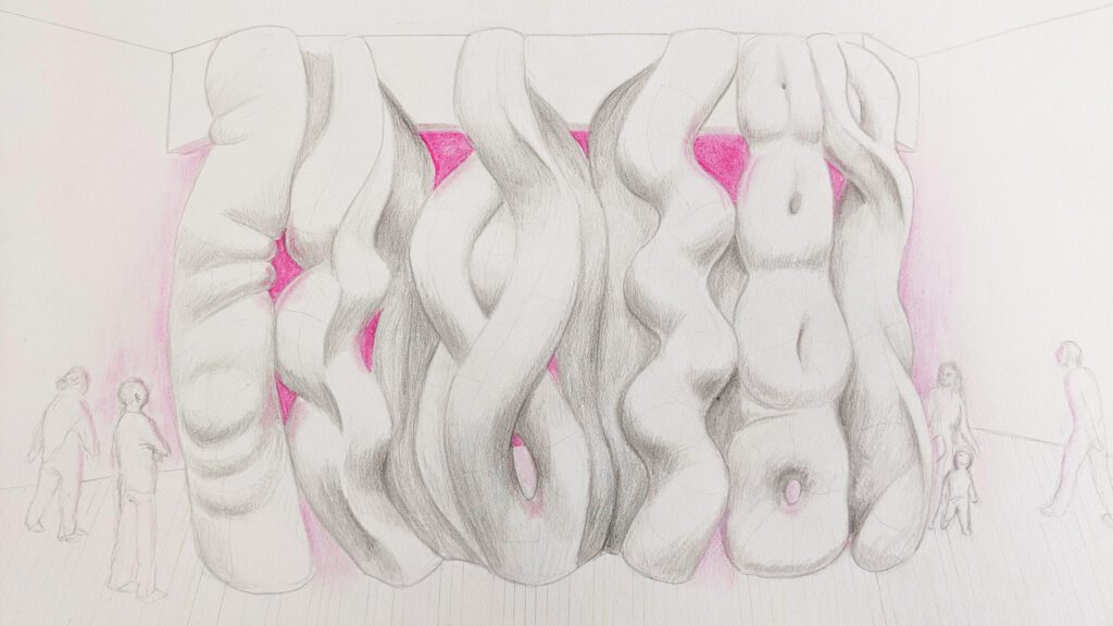
Stephanie views her artistic practice as an extension of her experiences observing the world and learning from it. When designing for In the Glow, Stephanie wanted to push herself to try things she had never done before. “I really wanted to challenge myself to make a large-scale exploration,” she explains. “To experience a sculpture, you have to move around it with a human body. And the larger the piece, the more you have to be aware of your physical relationship with it.” This was a challenge that Stephanie met head-on: the central piece will be a 16-foot-tall and 20-foot-wide sculpture made of pieces of white industrial felt meticulously stitched together. The sculpture will hang like a multidimensional curtain of writhing, body-like, and serpentine forms. A neon-pink wall will stand about 10 feet behind the curtain and reflect the light of the room onto the white felt. Viewers will have the opportunity to walk around the sculpture, immersing themselves in a pink, glowing space.
Size is not the only boundary Stephanie hopes to push with this piece. Stephanie feels that a lot of her work is already perceived as “feminine,” and she wants to examine the full spectrum of what feminine and female forms can mean. “I’ve been in a female-identified body all my life,” Stephanie explains. “I’ve had children. I’ve had a miscarriage. I’ve had all these life experiences. With the female body, it feels culturally okay to share certain experiences, but other things are hidden away.”
Stark among these experiences for Stephanie was having children and the changes to her body that she did not anticipate. “It would have made me feel a lot more sane to have been warned of some of the more uncomfortable, grotesque, and fascinating parts of what a body goes through,” she reflects. This pushing between the pretty and the grotesque, the attracting and repelling, the familiar and unfamiliar, is part of what Stephanie wants to evoke from this piece. She explains, “I wanted to focus on the strength and the raw power of feminine forms, but also leave space for the idea of soft power—like leading through cooperation and collaboration as opposed to leading with force.”
For a long time, Stephanie didn’t feel comfortable talking about the feminist aspect of her art because of the pushback. Now, though, she’s trying to be more vocal, without being heavy-handed, so she can raise awareness for a range of experiences and realities. Even the monumental size of the central sculpture plays into Stephanie’s relationship with womanhood and speaking out. “I’m really excited to blow these forms up to be huge and really take up space,” she says, “because that’s one of the things that has always been an issue for me as a woman. I’m always aware of everybody else’s space and trying to make sure they have what they need, but sometimes at the expense of myself.” Stephanie continues to play with the idea of femininity with the smaller freestanding sculptures and wall pieces also included in the exhibit. “Some of the pieces are playing with these organic and intriguing forms. They’re almost menacing because they look kind of familiar but are also mysterious,” she says.
Playing into this element of mystery is the fact that Stephanie is not positive what her pieces will look like in their final form—particularly the show’s centerpiece, since a lot of science and engineering go into making a free-hanging sculpture. “In the Glow is very experimental for me, which is exciting,” Stephanie says. “I keep repeating to myself that I am making something that has never existed before. No one can tell me if it is right or wrong. This project is going to be what it is. And that’s really freeing.” The opening reception for In the Glow will take place on September 28 from 2pm to 4pm at the Triton Museum of Art in Santa Clara.
Much like releasing the need to control the final physical form of her sculptures, Stephanie has also embraced the idea that different people will have different responses to her art. She says, “People can be uncomfortable with abstract forms because they want to know what something is supposed to be. You can have whatever reaction to these pieces you want. There is no right or wrong in what you see or how you respond to it. I hope people will find what resonates with them.” To Stephanie, art comes back to this very concept—that it is all about making connections and finding meaning in one’s own life. She concludes, “The highest sort of thing art can do is make me feel connected to other people or ideas. I love finding kindred spirits through my art. It makes me feel like maybe I’m not so alone in the world.”
Stephanie was also featured in issue 5.2 in 2013.
Stephanie Metz: In the Glow
September 14 – December 29, 2024
Santa Clara, 8/26/24– The Triton Museum of Art presents Stephanie Metz: In the Glow, an exhibition debuting a series of evocative fiber sculptures. Wool felt and body-like forms combined with reflected color explore themes of soft power, aesthetic perception, and the paradoxes of female life.
The free-standing and wall-mounted sculptures and immersive installation transcend stereotypical notions of textile art as decorative and domestic. Metz uses a nuanced abstract visual language to allude to the contradictions of a woman’s experiences— vulnerability and resilience, internal and external perceptions, and working within and against gender biases and expectations. The felt material used to make the sculptures reflect these contradictions, embodying both the tender and the tough by being supple yet durable.
Sculpted from wool fibers compressed into freestanding dense shapes or sutured from pieces of thick, smooth industrial felt, Metz’s visceral organic forms incorporate carefully placed pink pigment. Pink, a color loaded with cultural and symbolic significance, highlights both conformity and resistance to gender binaries. Optical interactions between the white sculptures and reflected pink light reveal lines and contours and draw attention to the very act of seeing color.
A monumental stitched industrial felt sculpture at the center of the gallery invites visitors to immerse themselves ‘inside the glow’ created between the 16- by- 20- foot ‘curtain’ of undulating abstracted figurative forms and a wall of fluorescent pink paint. Stephanie Metz: In the Glow expands conventional definitions of the feminine and explores how edgy softness can hold space, command presence, and provoke thought.
The exhibition will be on view from September 14 to December 29, with an opening reception on Saturday, September 28 from 2 – 4pm.
For more information, please contact Stephanie Metz at 408-910-5476, stephanie@stephaniemetz.com or visit www.stephaniemetz.com/#/in-the-glow